How a Brutal Designer Review Made FlowPilot's Landing Page Redesign Easy
With help from Claude Design and Claude Code, and two months of foundation work that made it possible.
"C'est de la merde ! Qu'est-ce que tu veux que je te dise, c'est de la merde !"
("It's shit. What do you want me to say, it's shit.")
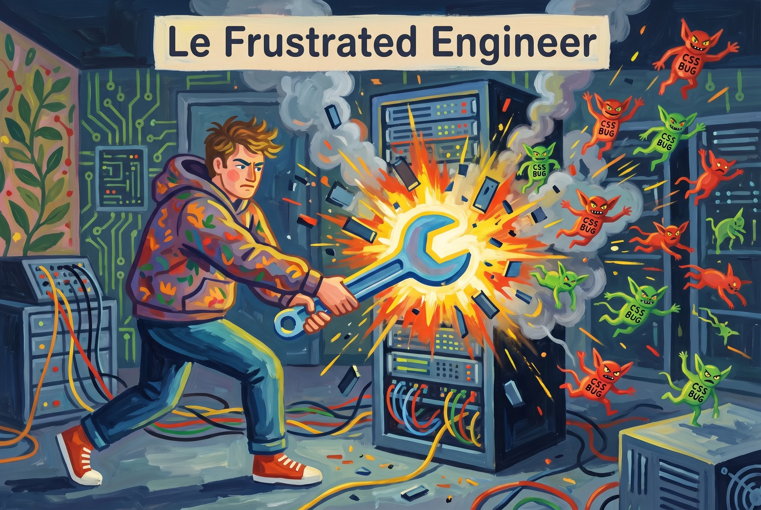
That's a close friend, a stellar web app designer whose judgment I trust on web app design more than my own, looking at the FlowPilot UI I had proudly shown him as "ready to launch." He didn't bury the lead.
We bit the bullet. Postponed the launch. Spent the next two months rebuilding the whole UI on top of a real design system: 40 atomic components, 57 UI test pages, dark mode, design tokens, complete page rewrites. Date pickers from scratch with complex logic. Editable tabs. Flow Production Tracking-specific filters and entity refs. Chat components. Log pages. All of it.
Months later, I used Claude Design and Claude Code to redesign our landing page over a weekend. The two months of challenging, often tedious foundation work were the only reason it was possible.
This is the post about the math of compound interest on infrastructure.
I'm not a designer
I'm a software engineer who came up in VFX. People in VFX tend to like adjacent things, movies, photography, comics, design, even on the engineering side. So I always cared about how the UIs I shipped looked. I had opinions about typography. I noticed when something was off.
What I didn't have was a designer's eagle eye. The thing that catches the small detail you've stared past a hundred times because you wrote it. The thing that holds a mental map of every component on every page and notices the second one of them drifts. The thing that designs a Figma component with the right props on it so the code system that grows from it has solid bones.
Without that eye, FlowPilot's UI in late 2025 was, technically, working. Every page shipped what it needed to ship. But each page had been built fast and somewhat independently. Spacing was vibes. Buttons looked similar but not identical. Modal weights diverged. We were not a design system. We were a collection of small accidents.
The brutal review
Before launch, I asked the friend mentioned above to take a pass. I expected pointed feedback on a few rough edges. I got the opening line of this post instead.
When the smoke cleared and we walked through the actual product, the complaints were specific:
The biggest sin. Spacing, gaps, font sizes, color usage, and button styles were inconsistent across pages. Each screen had been built in isolation, and it showed. Nothing was outright broken; everything was slightly off-key.
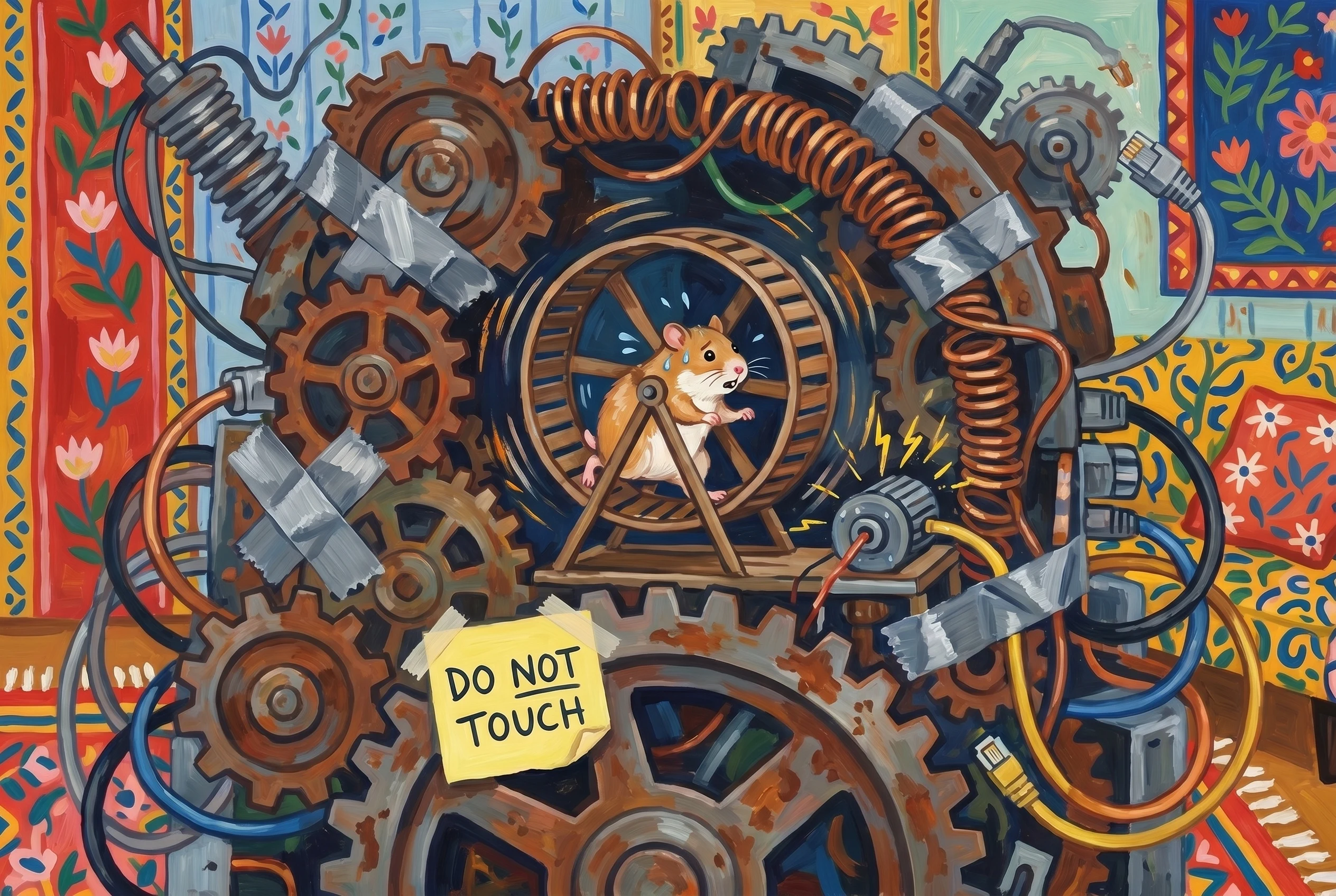
Hard-coded colors, magic-number spacing, button variants implemented by
copy-paste. There was no emphasis="high|low|none", no color="primary|secondary|positive|negative", no semantic
tokens. Each component was a snowflake, which meant any change had to be
made everywhere. Death by a thousand divergences.
A worked example we kept coming back to. The picker let you choose a chart palette by name, and you could only see the colors elsewhere on the page, after you had already made the choice. Backwards. The fix was obvious in retrospect: render the colors inside the select item, so you choose visually, not by typing or guessing. We rewrote it. Then we noticed five other components with the same flavor of bug.
The brutal review was not, fundamentally, about taste. It was about compounding inconsistency. Every divergent button, every off-by-4px spacing, every modal that didn't quite match the others, they each cost almost nothing in isolation, and accumulated into a product that felt unserious.
I don't regret the mess that came first
Worth saying clearly, because the rest of the post sounds like a love letter to design systems: I do not regret iterating without one for the first year. The earliest stretch of a product is for finding out what the product is. You're validating functionality, UX flows, who actually uses what, what to delete. If you spend that stretch picking type ramps and tokenizing your spacing scale, you're solving the wrong problem.
Premature design systems have their own failure mode. You commit to patterns that end up wrong for the product you eventually become. You make changes feel expensive when they should feel cheap. You build infrastructure for a destination that turned out to be a different city.
Could a tool like Claude Design change this calculus, by letting a designer collaborate on the prototype from day one? Maybe. I don't think so. The opening stretch of a product wants chaos. You can clean it up later, after you know what "later" looks like.
But "later" did arrive. And when it did, the next two months were ours to spend.
Two months. One bullet. Bitten.
The friction was real. Postponing launch was painful, internally, externally, psychologically. We had a date. We let it go.
The work was longer than expected. It always is. The friend gave us the design system to anchor on; Claude Code did the bulk of the implementation. We added components one at a time, with UI test pages for each, with documentation, with dark mode from day one because we knew VFX people would expect it (you ask any artist on a client call: they're using dark mode).
The rewrites were aggressive. Among other things:
- Date pickers from scratch, including a date-time picker, range pickers,
relative date tokens (
"last 7 days","this quarter") that resolve at query time, and the long tail of edge cases nobody enjoys writing. - Editable tabs with reorder, rename in place, persistence, the full contract.
- Flow Production Tracking-specific components: filter editor with the full Flow Production Tracking field semantics, status pills with display-name resolution from the Flow Production Tracking schema, entity reference chips with linked navigation.
- Chat components for the AI assistant, with thinking indicators and tool-call rendering.
- Log pages for automation execution, with structured filtering.
- Every existing page rewritten on top of the new system. Dashboards, charts (now widgets), pages, settings, super-admin, all of it.
Months later
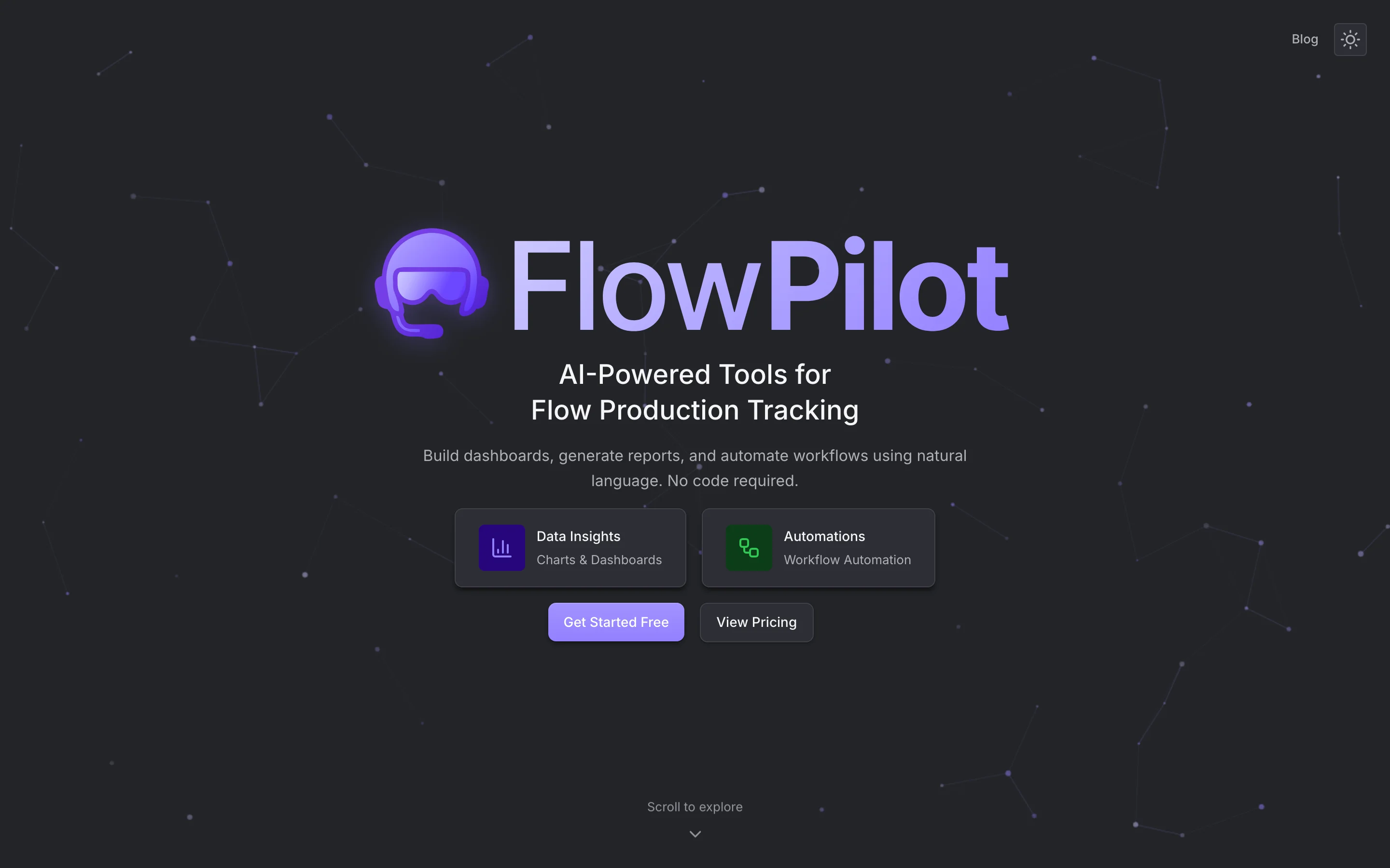
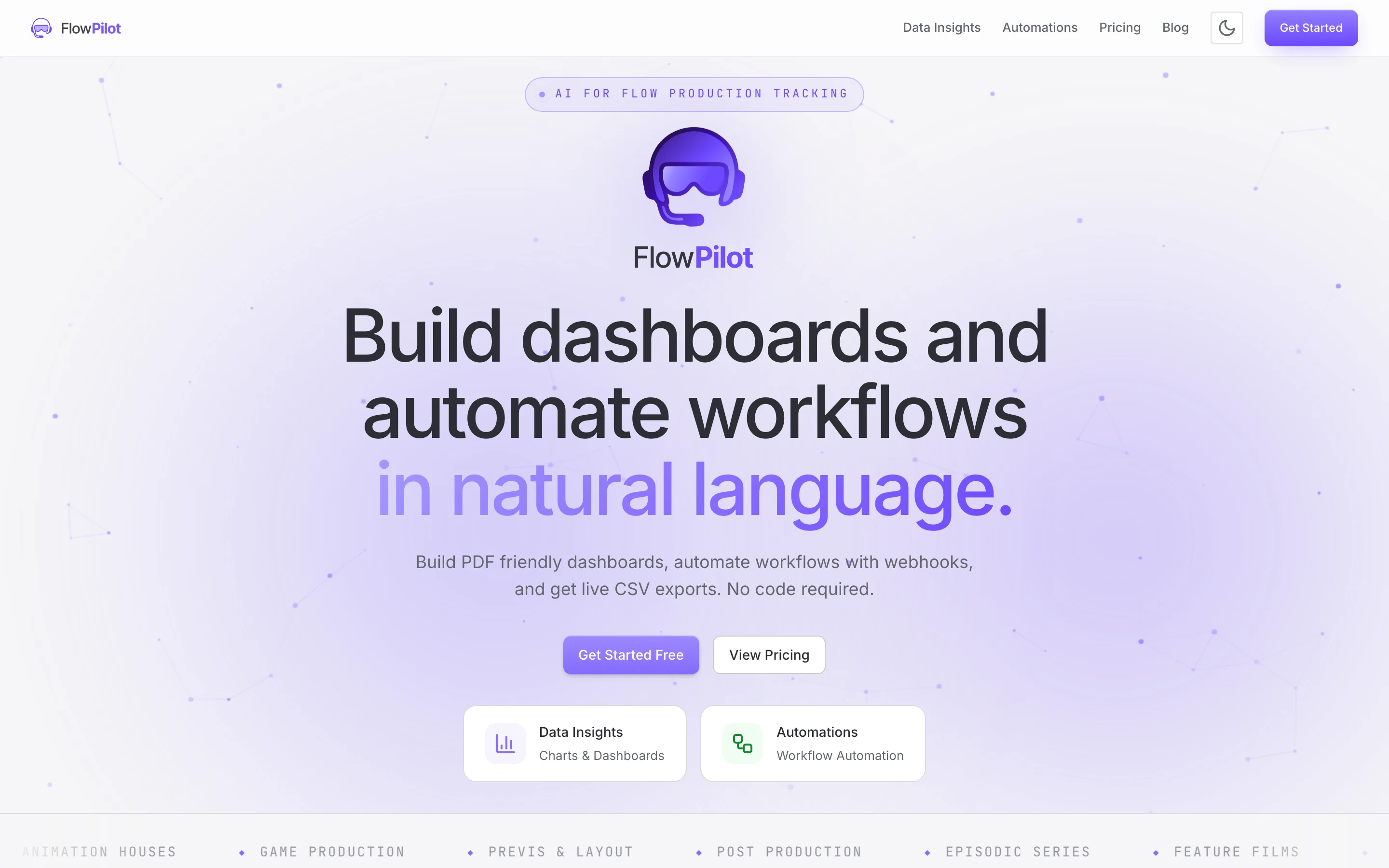
Spring 2026. The design system has had time to settle. We just shipped a big refactor renaming charts to widgets and promoting data sources to first-class entities. The landing page is a little stranded, the copy talks about charts and recipes, the screenshots are from the old builder, the YouTube demo is outdated. The whole thing needs a refresh.
Claude Design launches. It can connect to a GitHub repo, import the design system already in there, and let you prototype against it in HTML/CSS/JS. The premise is exactly what I want.
The designer hat
I connected the FlowPilot repo. Claude Design pulled in the design tokens, the logos, the components. It took maybe ten minutes. The interface for working on prototypes is genuinely interesting, you can iterate visually, generate variations, drop components onto canvas, and ask for animations. For someone who isn't a designer but has opinions, this is leverage.
Claude will invent things
The first attempt was an aggressive miss. I asked for a redesigned landing.
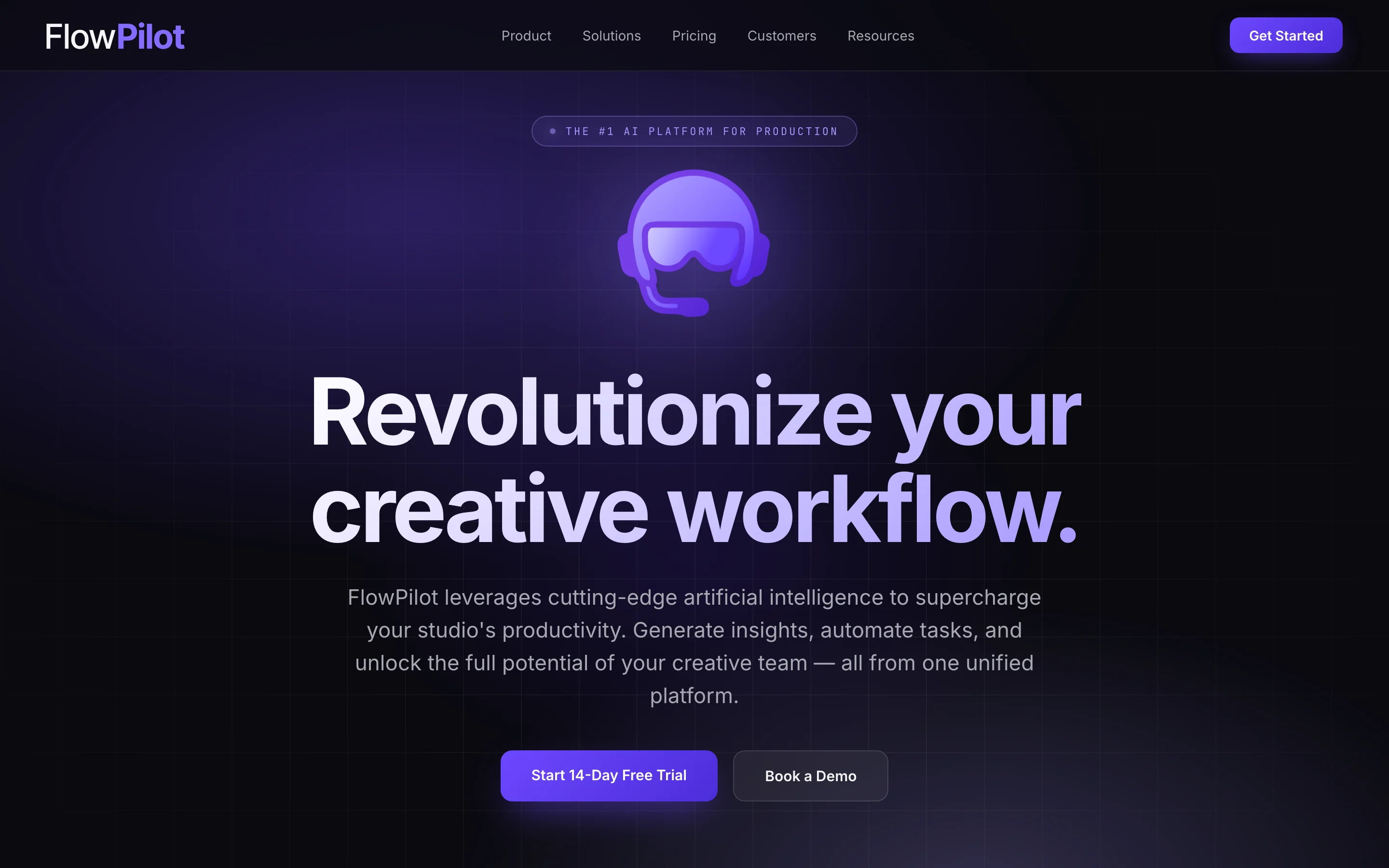
What came back was a slick dark-aurora landing with claims that weren't true, features we don't ship, and a multi-section navigation menu I had never built. Claude Design was, it turns out, very confident by default. It happily filled in anything it didn't know. So I pushed back:
"A lot of the claims are untrue. Stick to the copy that's already there. You can add things, but you can't invent them."
"We don't have a top nav. Just a Blog link and a theme toggle. You invented the rest."
The lesson holds whatever AI design tool you use: point it at the source of truth, hard, before you ask for variations. The agent will read your real source code if you tell it to. It will not, by default, treat your real product as more authoritative than its priors.
Three variants in an afternoon
Once Claude Design had read the actual landing source and stopped inventing, we generated three full landing-page directions side by side:
- Cinematic, dark, brand-forward, big animated logo, scroll-pinned showcases, a horizontally paginated product pager, a credits-roll final CTA.
- Editorial, light, magazine-style, Instrument Serif display type, an asymmetric grid, numbered pull-quotes for features, a ledger-style pricing table.
- Terminal, developer-tool dark, mono-heavy, a live-typing prompt that
builds a chart, a tabbed-IDE feature showcase, a
compare.csv-style pricing layout.
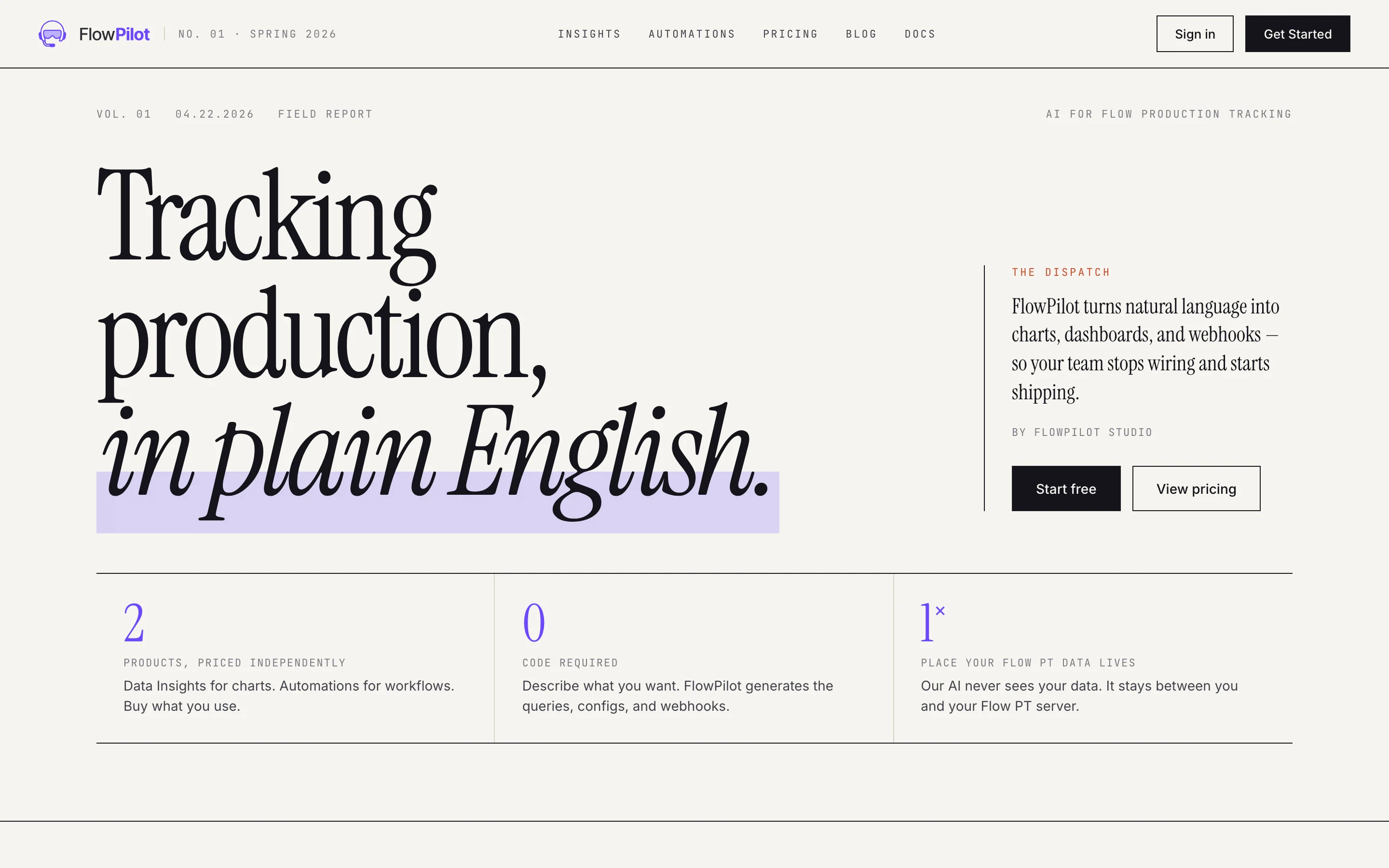
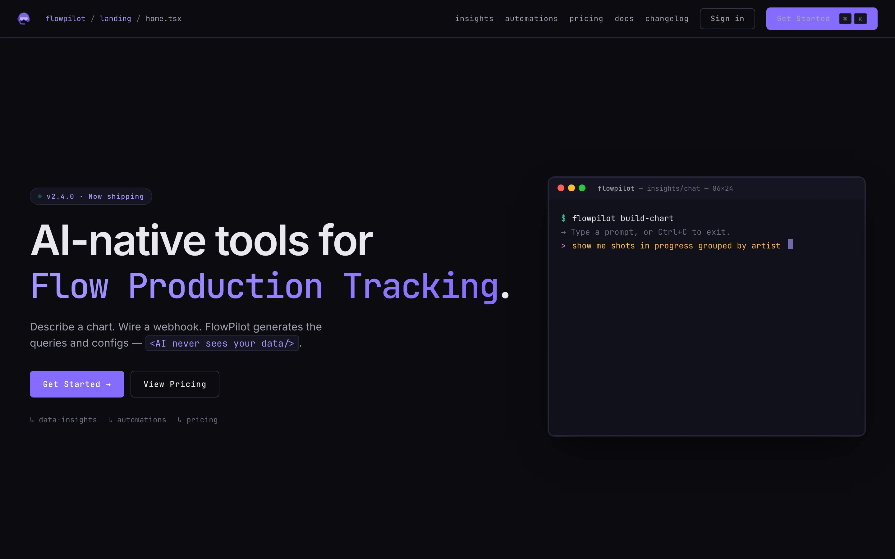
Three full directions, in an afternoon. This is the unlock. I would never have built three. I would have picked one based on a vibe and committed. With three sitting next to each other, the choice was obvious. We took Cinematic.
The counterintuitive lesson: AI design tools are at their best when you use them to reject directions, not commit to one.
The engineer hat
Claude Design exports a handoff bundle, the prototype HTMLs, a tokens CSS file, a SKILL.md for the receiving agent, a README.md with explicit
"READ THIS FIRST, ASK BEFORE IMPLEMENTING" instructions. It's a thoughtful handoff format.
I handed the bundle to Claude Code and asked
it to plan. It read the bundle, read our existing landing components, read app.css, and came back with an implementation plan organized as a "what
to take, what to keep, what to drop" matrix. We argued through it. I rejected some
things (their pricing redesign was almost identical to ours, no need to touch). I
added others. Then we built.
The unglamorous wins
The seam between AI design output and AI code implementation is where most of the "I shipped this in a weekend with AI" posts gloss over the work. Some of what we actually had to do:
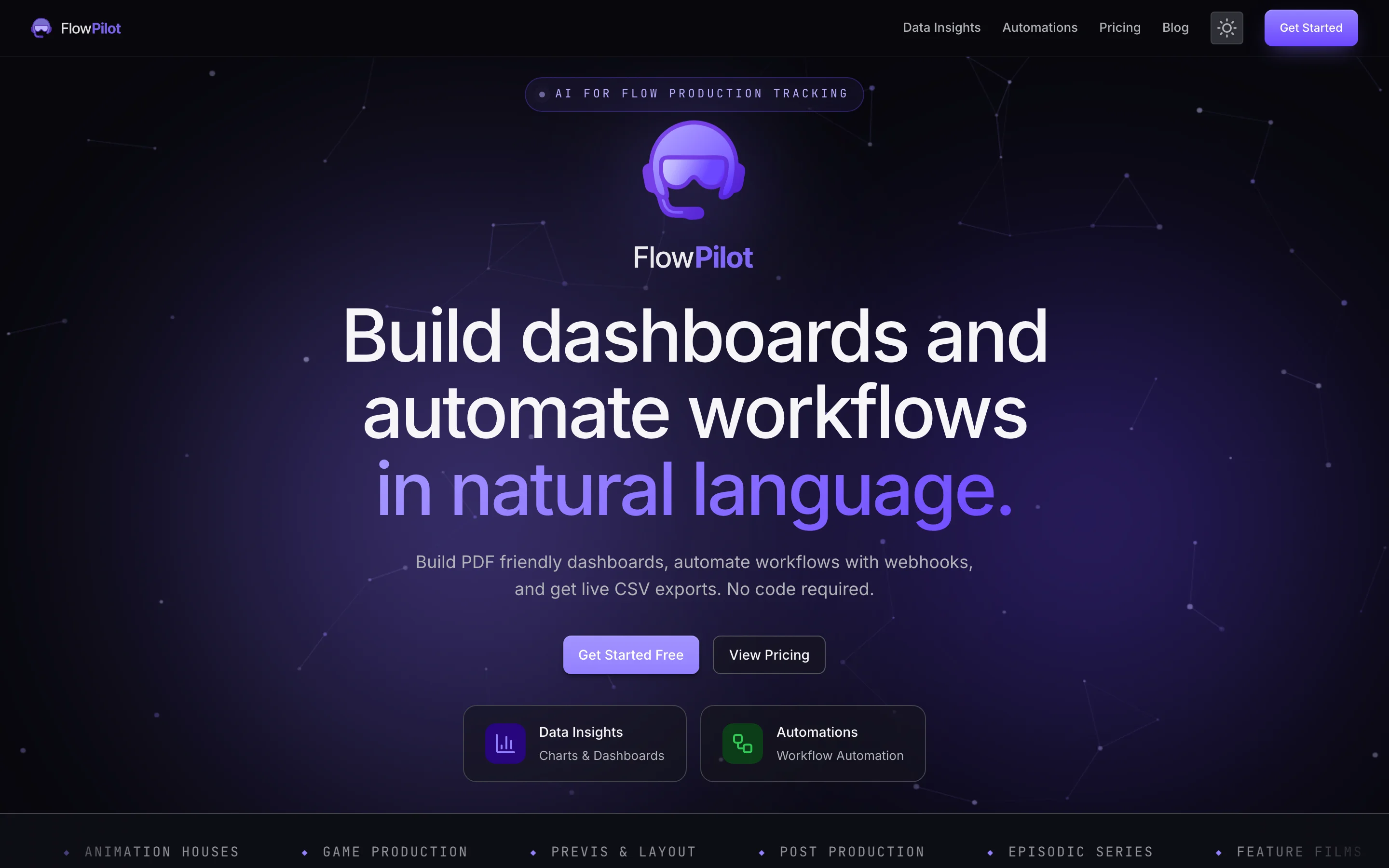
The prototype invented its own dark mode palette. Not bad, just not ours. We mapped every color back to the design system's existing semantic tokens, so dark mode on the new landing matches the rest of the product instead of looking like a visiting cousin.
First dark mode pass was completely broken. Navbar light grey on a black background, illegible. The cause was a CSS quirk specific to our framework that the browser silently ignored. No error, no warning, just nothing applying. Five minutes of head scratching, two characters changed, dark mode came alive.
The prototype wanted to load a custom monospace font from a third-party CDN. Our security policy doesn't allow that. We dropped the load entirely and let the browser fall back to the system monospace font, which looks almost identical for free.
The server rendered the light-mode logo. The client, in dark mode, swapped to the dark-mode one. The framework rightly complained about the mismatch. Fix: render both logos and let CSS pick the visible one. No JavaScript, no flicker.
The fade up on scroll animation worked for sections below the fold and not for the ones already on screen when the page loaded. The browser was collapsing the transition because the class change happened in the same frame as the element's first paint. Fix: defer the change by one frame. One line.
None of these are interesting individually. All of them are exactly the kind of friction that lives between "the prototype renders" and "the page is shippable." Every AI design tool that exists today produces output that has some shape of this tax. Solo operator pays it.
The component the design system couldn't give us
The most ambitious piece of the new landing is a live AI demo. Real prompts, real Flow Production Tracking data, real chart rendering. Cycles through a handful of scenarios that cover the widget types, stacked bar, pie, gauge, metrics card. It's the centerpiece, and there was no atomic component that did this. We built it from scratch.
And here's where the engineer hat fully comes back on. It is not enough to vibe-code a component into shape. The component has to be testable, reviewable, performant, documented. AI assistance doesn't change the standard; it changes the throughput.
Before any code: prepare the data
Before we wrote a single line of the demo component, we had to make sure we had real, interesting data to demo with. The whole pitch of the component is "real FlowPilot, real Flow Production Tracking data, real widgets", that means the data has to actually exist on a real Flow Production Tracking instance, and it has to look good on screen.
We started with the existing integration tests for the AI assistant. They cover what kinds of widgets the assistant produces from common prompts, which gave us a vocabulary of "scenarios known to work." From there, a few small lab scripts probed our internal Big Buck Bunny test project on Flow Production Tracking to check what data we actually had, shot counts per status, version histories, task bid versus actuals. Some entities were sparse or unrealistic. We seeded what was missing.
From that, four scenarios that exercise the four widget types we care about:
- Stacked bar, Shots by Sequence broken down by Status. Becomes a trellis after the second prompt (one chart per sequence).
- Pie, Versions by Status, with a follow-up that filters out N/A and shows percentage labels.
- Gauge, Bid utilization on Tasks (time logged versus total bid), with a follow-up that swaps the color preset and adds a sublabel.
- Metrics card, Total Tasks, Time Logged, Total Bid as three KPIs, with a follow-up that switches the visual theme and label position.
Every scenario was verified end to end, prompt, tool call, widget config, real data, rendered output, before we built any UI around them.
The principle: visually simplified, semantically truthful
The component on the landing is not a literal recording of the AI assistant interaction. The real assistant emits structured tool calls, intermediate states, logs, retries, useful in the product, distracting on a marketing page. So we made a deliberate trade:
What that means concretely:
- The widgets that render are the real widgets, same code your dashboards use, same chart engine, same gauge SVG, same metrics card.
- The data is real, fetched from our internal Flow Production Tracking instance via the same data-source executor the product uses.
- The prompts are real prompts that produce these results in the real assistant.
- The widget configs the demo "applies" are exactly the configs the assistant actually generates when you run those prompts.
- What's simplified: the chat shows only the human-facing exchange. No tool calls, no intermediate logs, no retry loops. The visual rhythm is tightened so a viewer who scrolls past in three seconds still gets the point.
This is the rule that justifies the existence of the demo: visually simplified, semantically truthful. If we ever drift into "the demo can do things the product can't," the demo is a lie. So far, it isn't.
One component, the full discipline
The first version of the demo component was about 700 lines that did everything in one place. It worked. It was also untestable. The patch logic, the data shaping, the chart rendering, and the fetch logic were all tangled together inside a single file.
Mid-build I told the agent the rule that runs in the rest of our codebase: components are for what's on screen. Anything that does real work belongs in a plain module with unit tests next to it. No exceptions for "small" helpers. No "I'll extract it later." Now.
The component dropped to about 300 lines of orchestration. The patch resolution, the data shaping for the four widget types, and the browser-side fetch wrappers each landed in their own small module, each with a focused purpose. The metrics extractor stopped using a regex hack and called the real formula parser the product already ships. Twenty unit tests cover the moving parts. The brain of the feature now has a brain you can argue with.
Loading without blocking
The first version of the demo also loaded every scenario on the homepage's server-side render. Every visitor to the front page paid for the data fetch even if they never scrolled to the demo. We refactored.
Two small public API endpoints replaced the upfront load. Each scenario is fetched on demand, then cached server-side for a minute so a burst of visitors only triggers one round trip to Flow Production Tracking per scenario. On the browser side, the component kicks off all four scenario fetches in parallel the moment it mounts, in the background. By the time the user has watched the first scenario play out, the rest are already cached. The homepage no longer waits on anything.
After
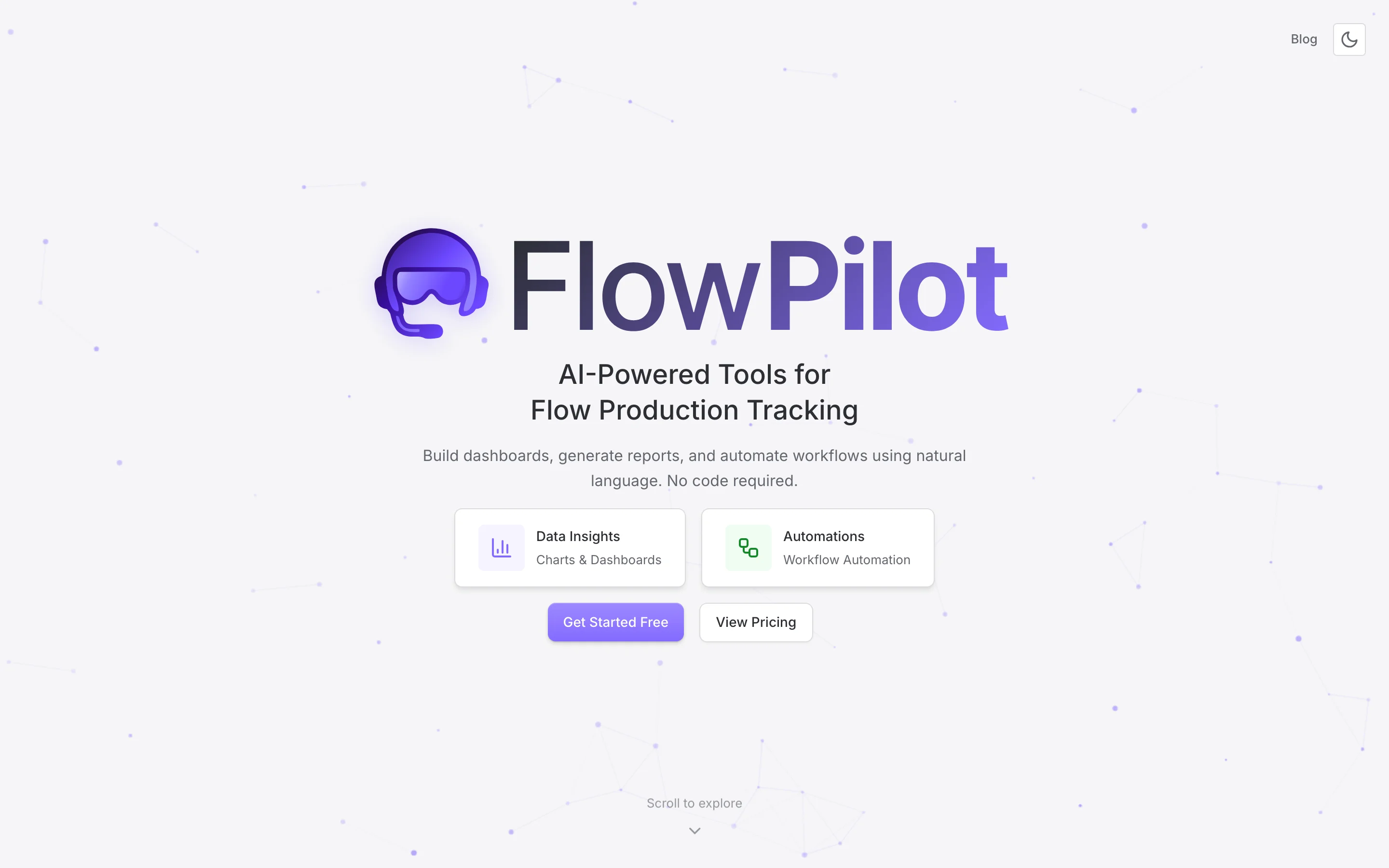
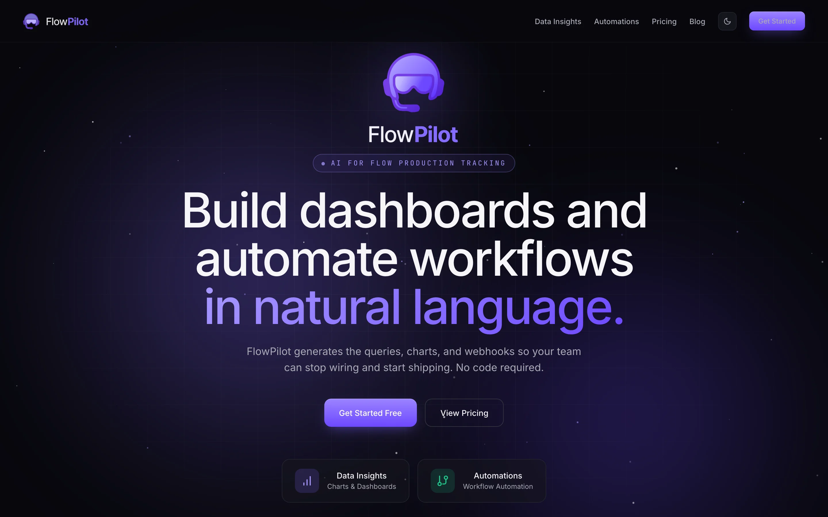
The redesigned landing. Same brand. Same tokens. Same data. Different page.
See it in action
Below is the actual <AiDemoShowcase /> component from the new landing
page, embedded directly in this blog post. It's pulling from the same lazy-fetch endpoints,
hitting the same FlowPilot internal Flow Production Tracking instance, rendering the
same widgets. Same code, same data.
The component cycles through scenarios automatically. Click any tab to jump directly. Scenarios prefetch in the background, so tab switching is instant after the first one resolves.
The numbers
One developer. One PR. Two days of focused work, mostly Saturday and Sunday.
- 29 files changed
- +2,780 / −1,596 lines
- 11 components touched or new (Hero, MarqueeBanner, LiveBuildSection, LandingNav, LandingFooter, etc.)
- 4 new modules in
src/lib/ai-demo/ - 2 public API endpoints (lazy AI demo data)
- 20 unit tests for the extracted pure logic, all passing
For comparison, the design system rebuild that this whole post leans on:
- 40 atomic components in
src/lib/components/ui/ - 57 UI test pages across categories
- ~2 months of dedicated work, December 2025 through February 2026
- One launch postponed
The redesign weekend used the design system as a constraint at every level. Every
button is a Button with emphasis and color props. Every card uses the existing tokens. Every spacing value
resolves to a --spacing-* variable. Without that backbone, Claude Design
would have given me HTML soup and Claude Code would have produced CSS we'd be paying
interest on for years.
What I'd tell a fellow engineer
The two months of design system work felt like a tax at the time. Months later, that work is the only reason a redesign-with-AI weekend was even possible. Without tokens, atomic components, and component props, the same AI tools would have produced unshippable output. The foundation is what makes the AI useful.
Claude Design's superpower is generating multiple full-fidelity directions fast. Use it to reject directions, not to commit to one. Claude Code's superpower is implementation against a real codebase. Use it for the work you'd otherwise do yourself.
The handoff between Claude Design and Claude Code is not seamless. There is real engineering work in between, token mapping, CSP compliance, hydration correctness, accessibility, performance. AI tools amplify what an operator can do. They don't replace the operator's judgment.
The earliest stretch of a product is for finding out what the product is. Premature design systems lock in patterns that turn out wrong. Iterate chaotically first. Build the system after you know what you're building. Time it right and the cost is bounded; time it wrong and you pay forever.
"C'est de la merde" was the most expensive sentence I've ever heard. It cost two months of focused work and a delayed launch. It was worth every day.
Try FlowPilot
Build dashboards, automate workflows, and pipe live data into Google Sheets straight from plain English. The new landing page (and the demo above) is the product talking about itself, in real time, with real Flow Production Tracking data.